Global Search Concept
Can we improve the way users search and gather information? Is there a solution that streamlines the time it takes to find desired artifacts?
Project Background
Client Ask:
A Proof Of Concept (POC) that solved the current challenges employees were having gathering information across company platforms.
Project Duration:
4 weeks
Final Deliverable:
For POC purposes, 2 Screen deliverable (Search screen, Search results)
Not shown: Upload Screen, Help Screen
Project Team:
Lead UX Designer
Associate UX Designer (Me)
Architect
2 Developers
Project Manager
Client side Business Analyst
Tools/Techniques:
Sketch
Zeplin
Font Awesome
Agile Process
Methods:
Stakeholder Interviews
Requirements and Constraints
Design Review
Visual QA/ Usability Bug Review
Research
Round 1: Gaining insight from the user
We intended to perform interviews with users, Figure 2 is the list of questions we compiled in preparation. I decided to leave blanks in the questions which made it easier to follow up with additional questions that favored alternative feedback. The questions were also formed with an intention to observe users interacting with their current platforms. By observing how they interacted with daily tools we would be able to learn their pain points.

Figure 1: A list of questions compiled for interviews with users

Figure 2: Questions were altered for stakeholder interviews
Round 2: Change of course, gaining insight from the client
The client felt it was difficult and time consuming to get in contact with employees so they decided to conduct their own user interviews before the UX team became involved. They provided us with a presentation of findings from their exploration sessions with their team. Our team decided to reconstruct our questions and direct them toward the client, as an effort to gain more information about the interviews they conducted (See Figure 2).
After gathering information and following up with additional questions we began forming our problem statement, and gained an idea of what the solution could be.

Sourcing Problems and Pain Points (PP)
Problem: Internal and External users had challenges searching for desired company artifacts that could be possibly housed in siloed company websites or on local employee computers.
Client input and PPs:
Employees are working in silos and are not communicating with each other when in need of artifacts
Lack of sharing capabilities, employees were sharing artifacts across BOX (Similar to drop box) and email
Management having difficulty reaching employees
Management is not aware of what files are stored on employees local computers
When searching on current platform results are displayed with endless scroll and unused filters
Suggested websites for inspiration: USAID.gov, Google
Wireframes
After interviewing with the client and establishing a Problem statement we created wireframes to validate aspects of our design direction. Designs were reviewed and feedback was provided by stakeholders.
Search Screen

Figure 3: Search Screen in “resting state”

Figure 4: User can filter their results in advance without using a term
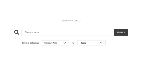
Figure 5: Searching using just a term
Figure 3: The wireframe reflects a “resting state”, the user is ready to search but has not made any selections. At this stage of the design the development team is setting up a third party program for staff to be able to login, so the design shows the user as logged in.
Figure 4: Planning for situations where users may not know exactly what they are looking for we designed drop downs that would filter results in advance. When a category is selected the other is locked, certain search terms can not belong to both categories.
Figure 5: Users can search using only terms.
Search Results
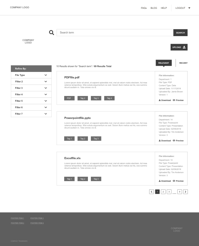
Figure 6: Search Results in “resting state”

Figure 7: User has activated the filter

Figure 8: User is viewing the file preview
Figure 6: The wireframe reflects a “resting state”, the user has searched a term and is now viewing results.
Interface Displays:
Artifact title, Short description, Tags based on metadata
File Information: Department orientation, File type, Content type, Upload date, Uploaded by, Version number
Actions to Download or Preview
View the artifact by selecting the artifact title
An ability to upload files to the Data Warehouse
PP* An endless scroll for search results on other platforms made finding the right artifact challenging. So we decided to add pagination and display 10 results at a time (For portfolio purposes only, I am only displaying 3 results).
Figure 7: Filters and Tags are pulled from client provided metadata.
Figure 8: The client requested a ability to preview artifacts before selecting files for view or download.
Post wireframe pending questions/ adjustments:
How are we treating the Login experience? The login experience differs based on whether the user is internal or external, how are we reflecting this in the UI?
For POC purposes how are we importing information, is an upload experience needed?
At this state we still do not have the necessary metadata to be able to design tagging and filters, so we worked with what we knew for example file type
Remove drop downs on search screen
Top Navigation: Remove Blog, Combine Help and FAQs
Move upload button from search results to search screen
Remove file description
High Fidelity
Based on client feedback we were able to finalize High Fidelity designs. Designs were reviewed and approval was given by stakeholders for Development.
Desktop: Search Screen

Figure 9: Users need to login to be able to search for artifiacts
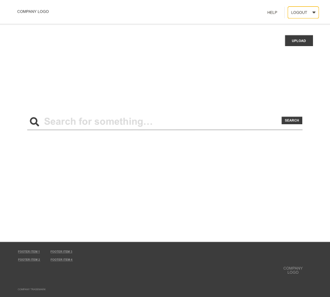
Figure 10: Logging in activates the search and upload button
Figure 9 & 10: Users need to login before enabling the ability to search terms and upload artifacts. It’s important to ask the user to login before searching because users are internal and external so items particular users don’t have access too will be filtered out.
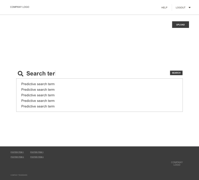
Figure 11: Predictive Search
Figure 11: With help from the development team we decided predictive search helped the user find what they’re looking for when they’re not sure.
PP* Feature added to help users find what they’re looking for faster
Desktop: Search Results
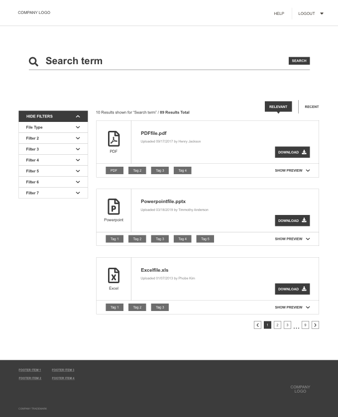
Figure 12: Search Results in “resting state”

Figure 13: User selects a filter and the tag appears under the search bar
Figure 12 & 13: Figure 12 reflects a “resting state”, the user has searched a term and is now viewing results. Once a filter is selected the tag appears under the search bar, the tag can be removed by clicking “X”. The results auto updates as the user selects additional tags.

Figure 14: File preview
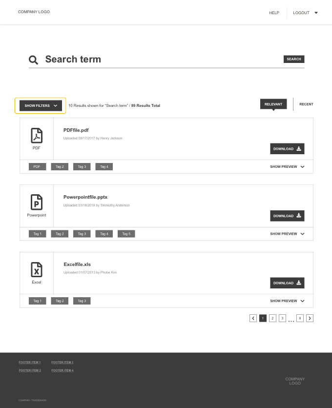
Figure 15: Hide/Show Filters
Figure 14: The wireframe preview made it difficult to view the file in a hover state. So we decided to add a collapse and expand file preview. The searched term is also highlighted in the file preview. If a user wants to view the file in its entirety they can select the file name and the file will open in a new tab. Files with no preview will show “No preview available”
Figure 15: Providing the users with an ability to show and hide the filter means they can direct their full attention to the goal, finding the artifact they’re looking for. Hiding the filter also enables a larger view of files when previewing.
10.5” iPad: Responsive Design (Search Results)
While planning the future state we were able to listen to users talk through challenges and wants for the next phase of work. A user brought to our attention the inability to access needed files when he was away from his computer. He regularly attended conferences and would have to download files in advance or request a files from a colleagues. The client requested a responsive design because employees were regularly in similar situations.

Figure 16: iPad Search Results design in “resting state”
Figure 16: To make the application responsive I decided to:
Condense the filter and sort menu
Add a jumping arrow to bring attention to results below the fold
Add a floating “back to top” button
Add a button for more results.
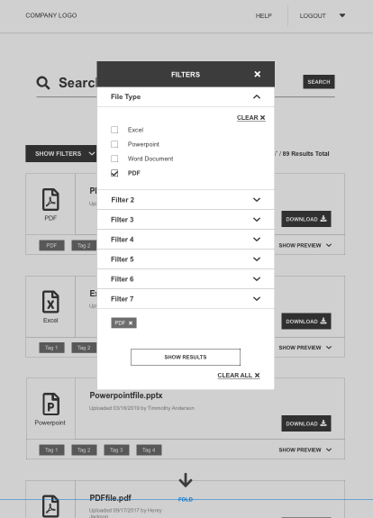
Figure 17: FIlter modal
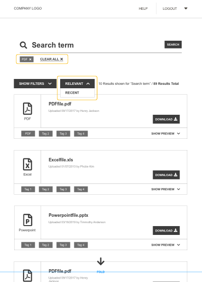
Figure 18: Adding Tags, Relevant recent drop down

Figure 19: File preview on iPad
Figure 17: Because of less screen real estate I decided to implement a modal, the user can still select filters and manage their tags at the bottom. When a filter is open the others will be closed by default.
Figure 18: After selecting the desired filters they are now viewable under the search bar, tags are also viewable under the search bar on the desktop design as well.
Figure 19: Users are still able to preview files on iPad.
Project Challenges/ Pending Questions
Not being able to interview users
Project Duration
Gaining access to Metadata late in the design
Designing an Upload screen for POC purposes, where is this information coming from and how will it be tagged? Manual tagging of information for POC
Manage duplicate and legacy files that are uploaded
How do we plan on adding sharing capabilities?
How will the system load larger preview files?